Interactive · Data storytelling · Consulting
Data Visualization Works
Selected data visualization projects from my time at Fathom Information Design.
Team
Fathom Information Design


National Geographic
What the World Eats
A viral interactive graphic from the "What the World Eats" series on Twitter held users' attention for an impressive 8-minute average.
Nike
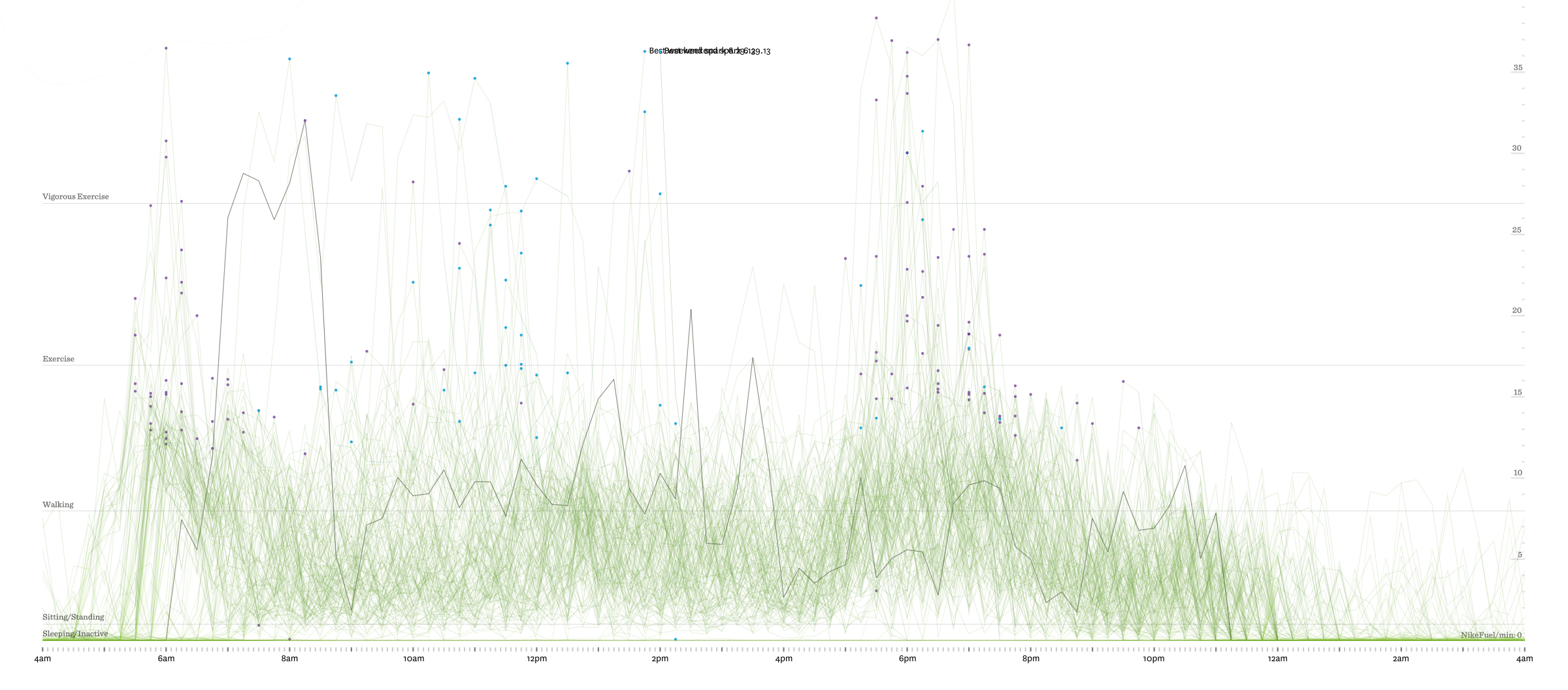
Nike Weather
Using activity monitor data we told a story about how people adapt their movements based on weather conditions, by crafting an interactive graphic to illustrate this phenomenon across various locations.
Design lead James Grady
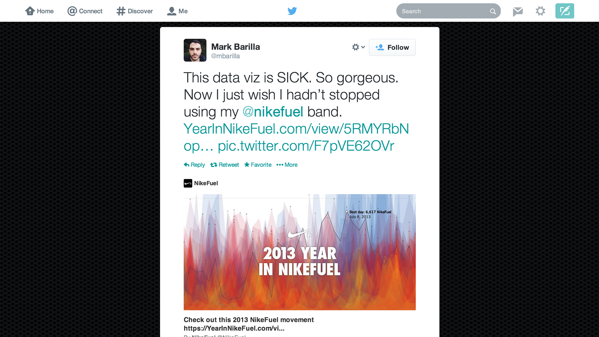
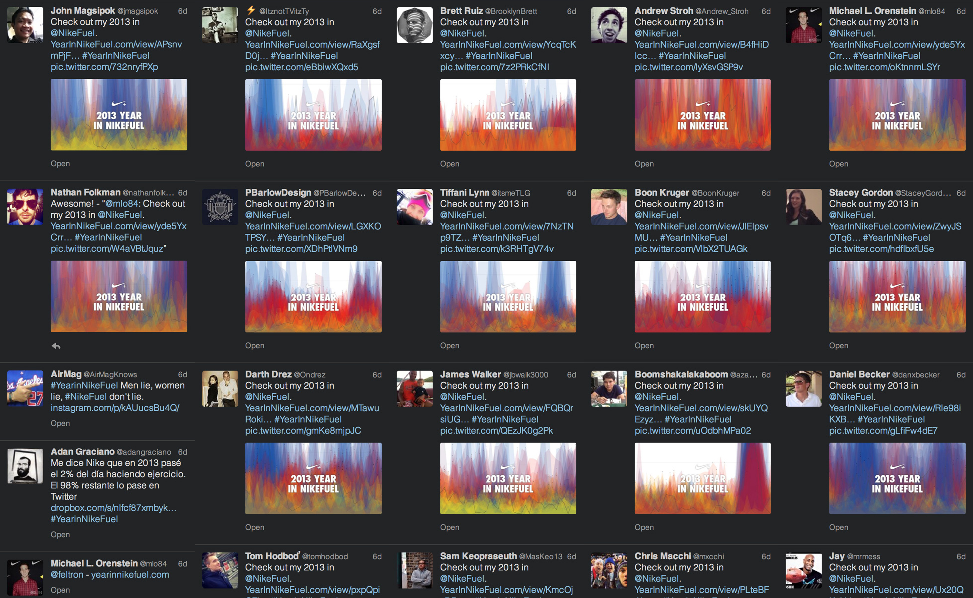
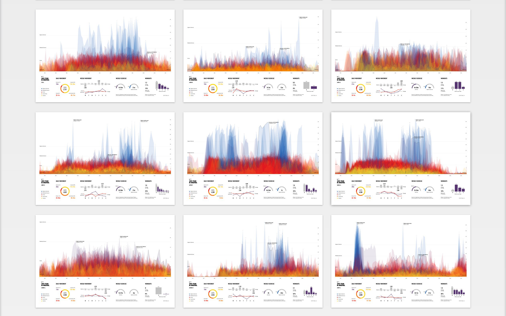
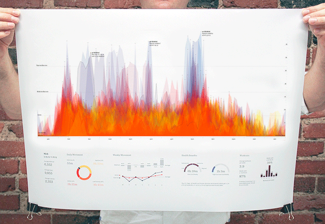
Year in Nikefuel
Every person has a unique movement pattern. I wrote code to visualize this diversity, pitched it to Nike, and they shared it with their NikeFuel community.
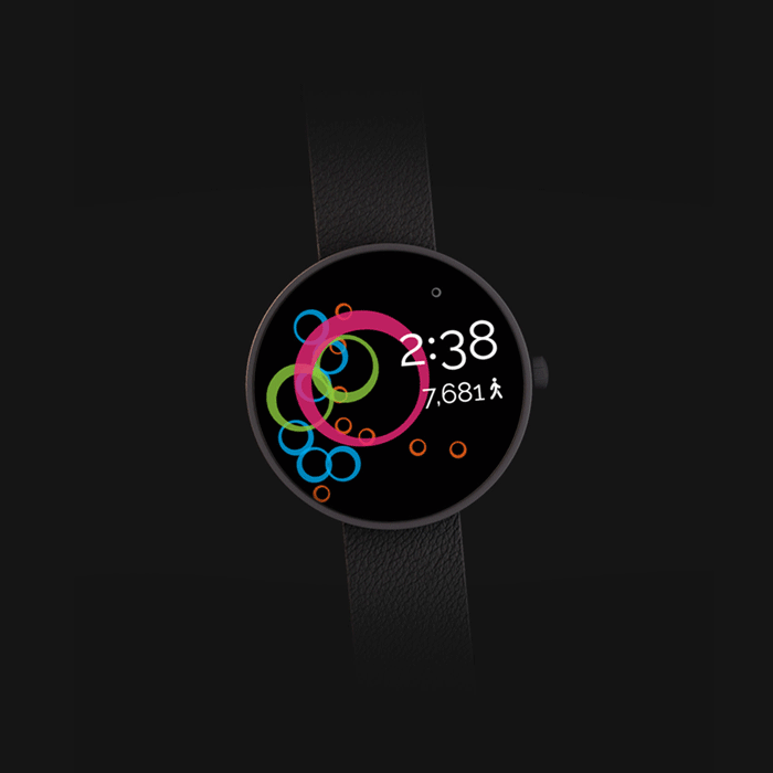
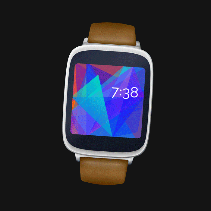
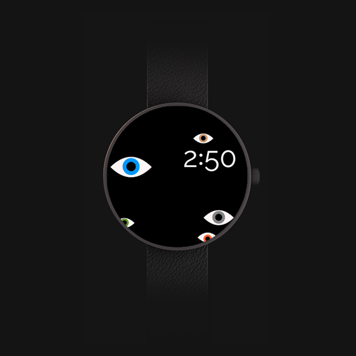
Fathom Watch Faces
Google invited Fathom to be featured in their watch face design experiments. James and I designed three watch faces that responded to a users movement, daily activity and watch face views.
Co-designed with James Grady
City of Boston
Urban Agriculture
I designed an interactive visualization mapping Boston's urban agriculture landscape, helping the city understand the distribution and impact of community gardens, urban farms, and food access points.
Illustrations by Rachel Harris
The Clinton Foundation
No Ceilings
Over six months, we explored the story of what governments value through the data they collect on gender equality worldwide.
Design lead James Grady
Want to see more?
Get in touch with me to see my in-depth case studies.