Design system · Design ops · WCAG compliance
Streamlining Design
Design System that achieved a 5x improvement in efficiency between design and engineering teams.
My role
I led the design system from concept to implementation


The design system launched in phases: Figma and B2B Web in 2021, revamped in 2022, and expanded to B2C Mobile in 2023.
The Problem
A disjointed legacy experience
In 2021, following a company rebrand, the mobile and web products looked outdated and lacked credibility. Colors, typography, and components were inconsistent across platforms.
More examples of inconsistencies across the platform
Web Product
Mobile App
How might we increase velocity while creating a better user experience?
The System
Introducing the Design System
Built for the end user
Beyond achieving a consistent user experience, I used this as an opportunity to improve accessibility and add dark mode support.
Accessibility built in
We ensured contrast met at least AA compliance but strived for AAA where possible.
We chose to align with MUI components due to their extensive built-in accessibility features for interactions.
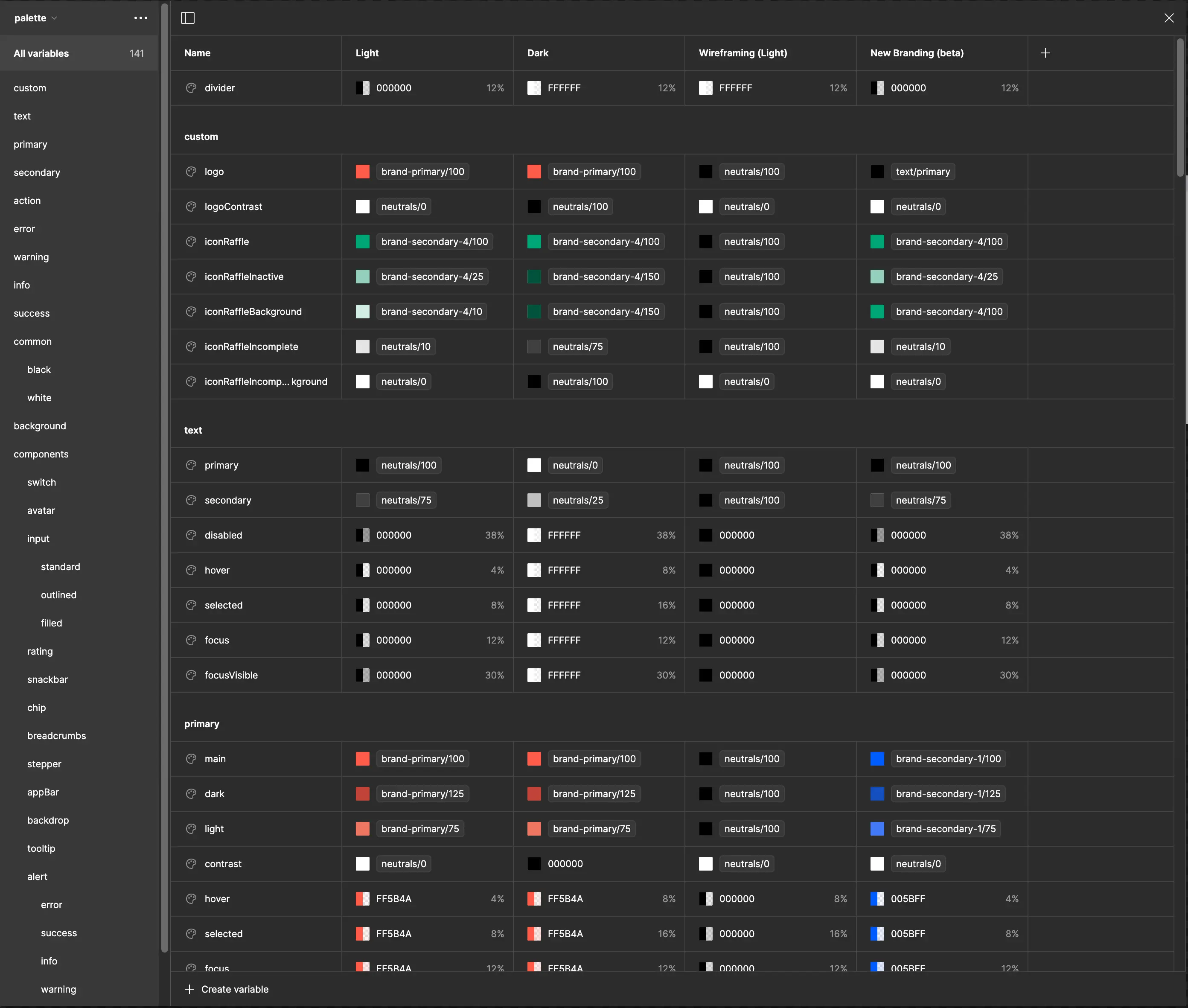
Dark mode
Leveraging Variables we built dark mode into our tokens and adopted elevations from Material UI.
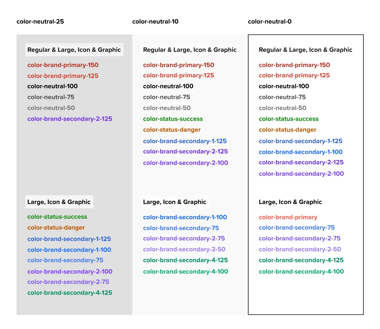
Design Tokens
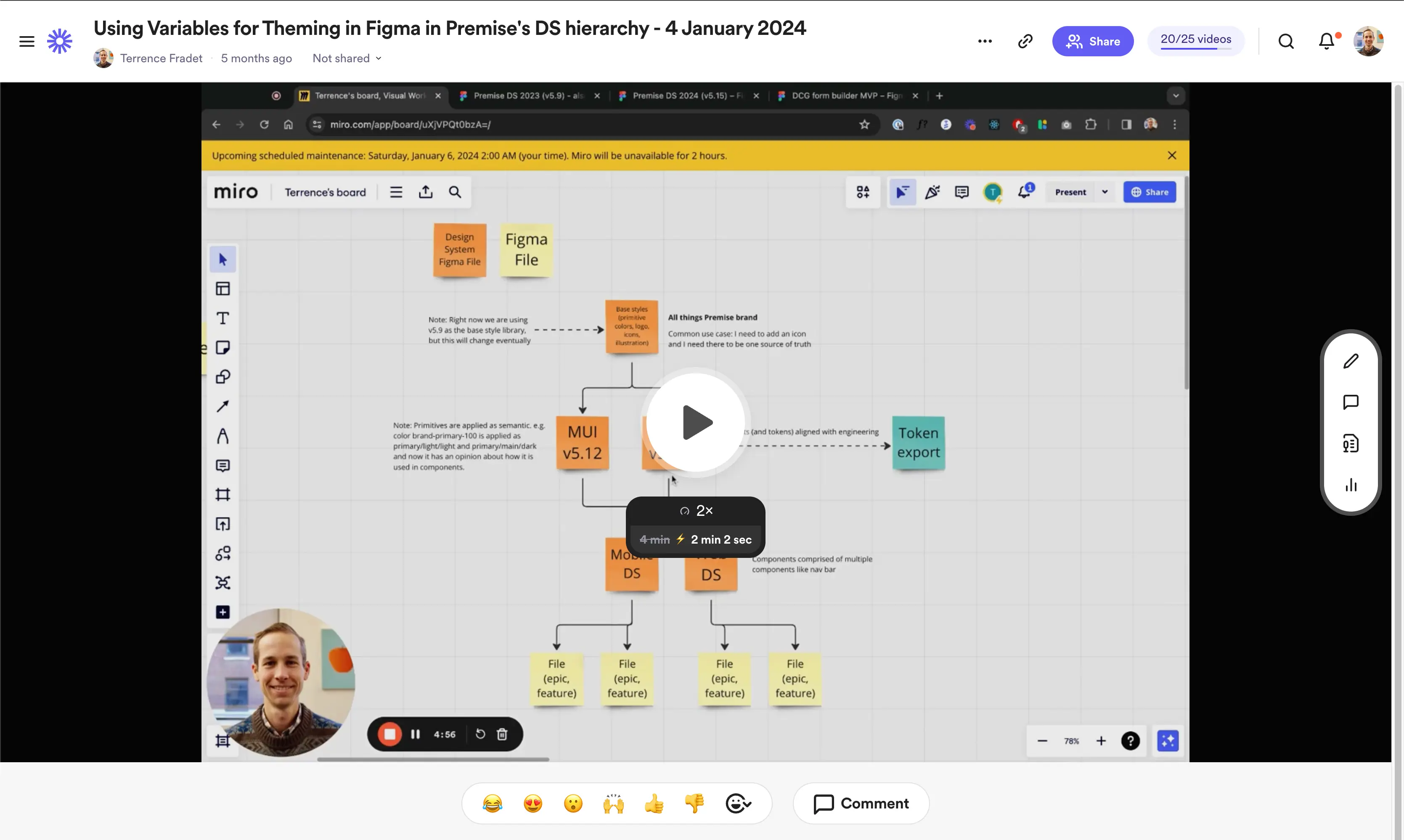
Implementing design tokens was an easy and effective way to ensure cross-platform consistency.
We used a simple Figma plugin to export tokens to a version-controlled GitHub repository. Figma's Variables feature also allowed for tokens like border radius and animations.
Mapping brand primitives to semantic tokens provided clear usage guidance, ensuring consistent design implementation.
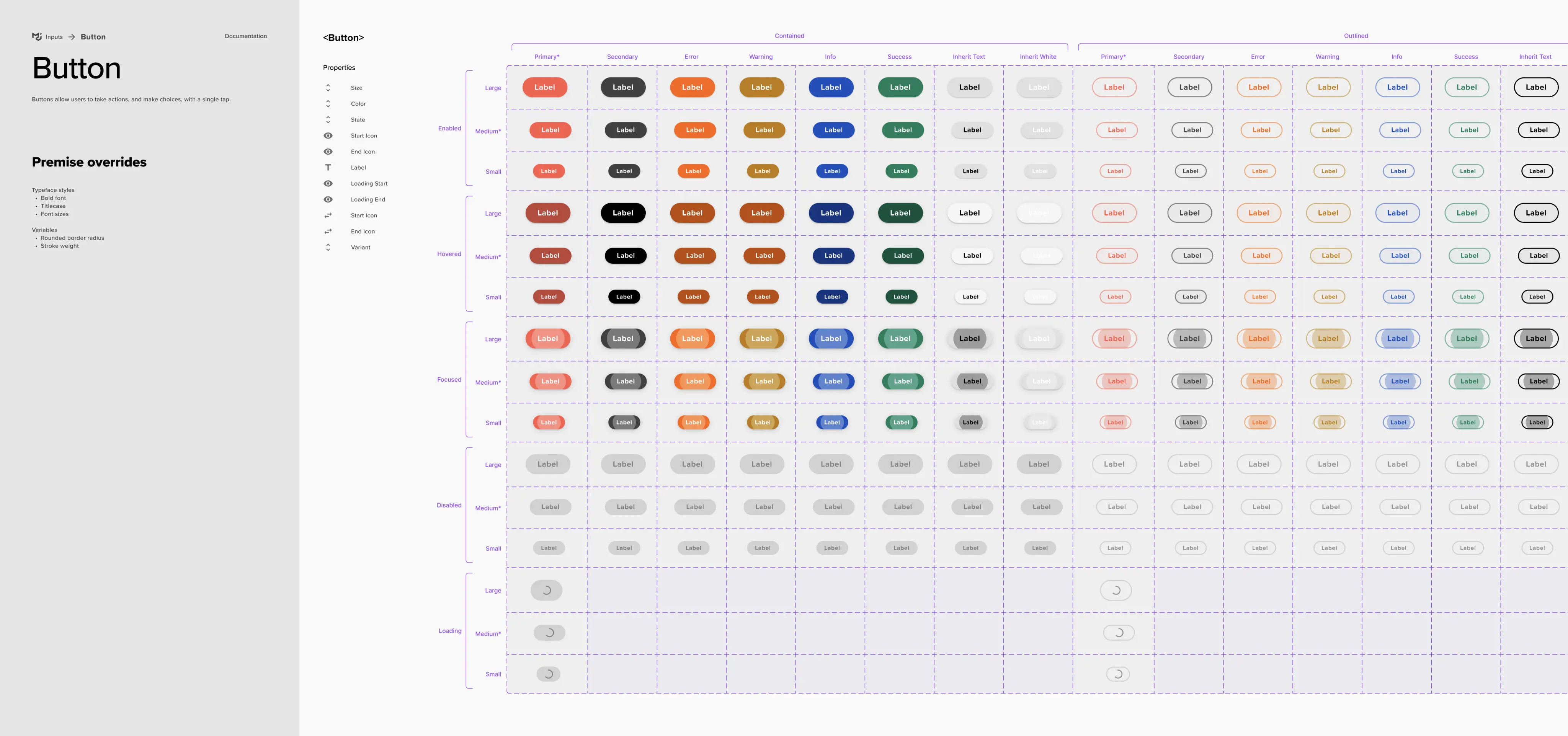
Built for designers by designers
I realized that for our design system to achieve ongoing adoption, ease-of-use and fostering creativity had to be central focuses.
Jumpstarted with best practices
I learned that simply setting up and publishing a design system file is not enough; it won't automatically work well for the designers using it.
By starting with the "MUI for Figma UI kit" and configuring it to meet our needs we were able to skip a lot of the leg work.
Using themes for wireframing
Beyond dark mode, we utilized Variable Modes (themes) for various purposes, such as creating lo-fidelity mockups. Additionally, we tested new branding as a theme before fully committing to it.
Templates jumpstart creativity
We created a web and mobile (platform) specific design system where we established navigation, headers and page templates.
Enabling Adoption
With Chris championing adoption across engineering teams, we developed a process that allowed us to build the design system without slowing down product development.
Maintaining velocity while building the system
Without a dedicated team, aligning with React components and following this process allowed us to decouple feature development from establishing the design system.
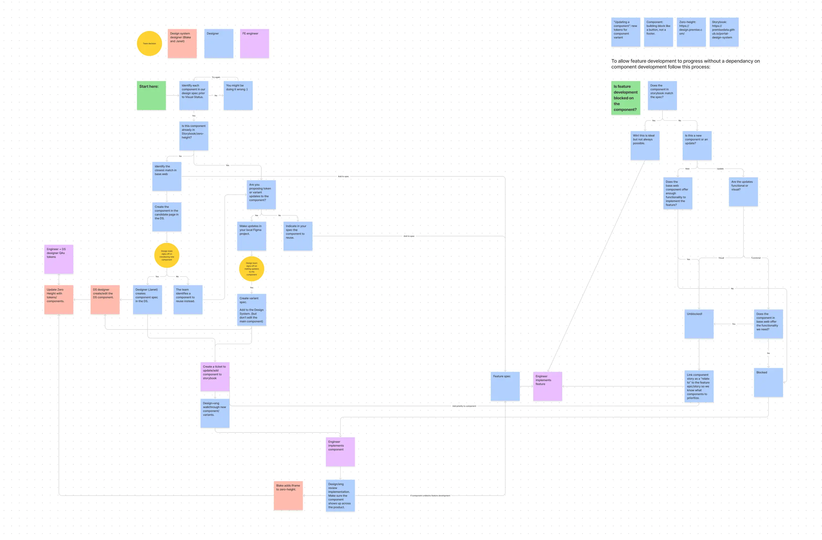
I used Loom videos to document changes and share them with the team.
The Impact
increase in designer and engineer velocity
The design system transformed team collaboration and efficiency. While isolating its impact on user satisfaction is difficult to measure directly, we saw a marked increase in app store ratings and customer NPS. The increased velocity enabled the team to ship more value to users.
App store rating
Customer NPS
less time on visual implementation reviews
Want to see more?
Get in touch with me to see my in-depth case studies.