Year in NikeFuel
Summary
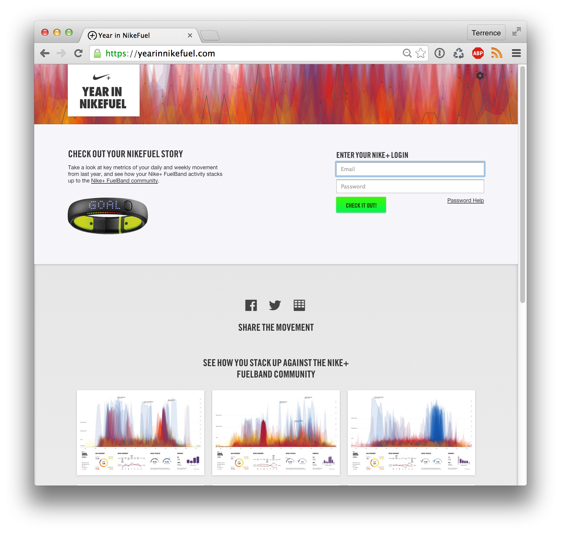
Year in NikeFuel featured a unique visualization for every Nike FuelBand user over their year of activity. The website allowed users to log in, gain deeper insights about how they move and enabled them to share these insights with friends and the Nike+ community.
Context
My role: Information Designer
The team: 1 engineer
Timeline: 4 weeks
Client: National Geographic
Deliverables: Data analysis, front-end coding, lo/hi-fidelity mockups.
Design Process
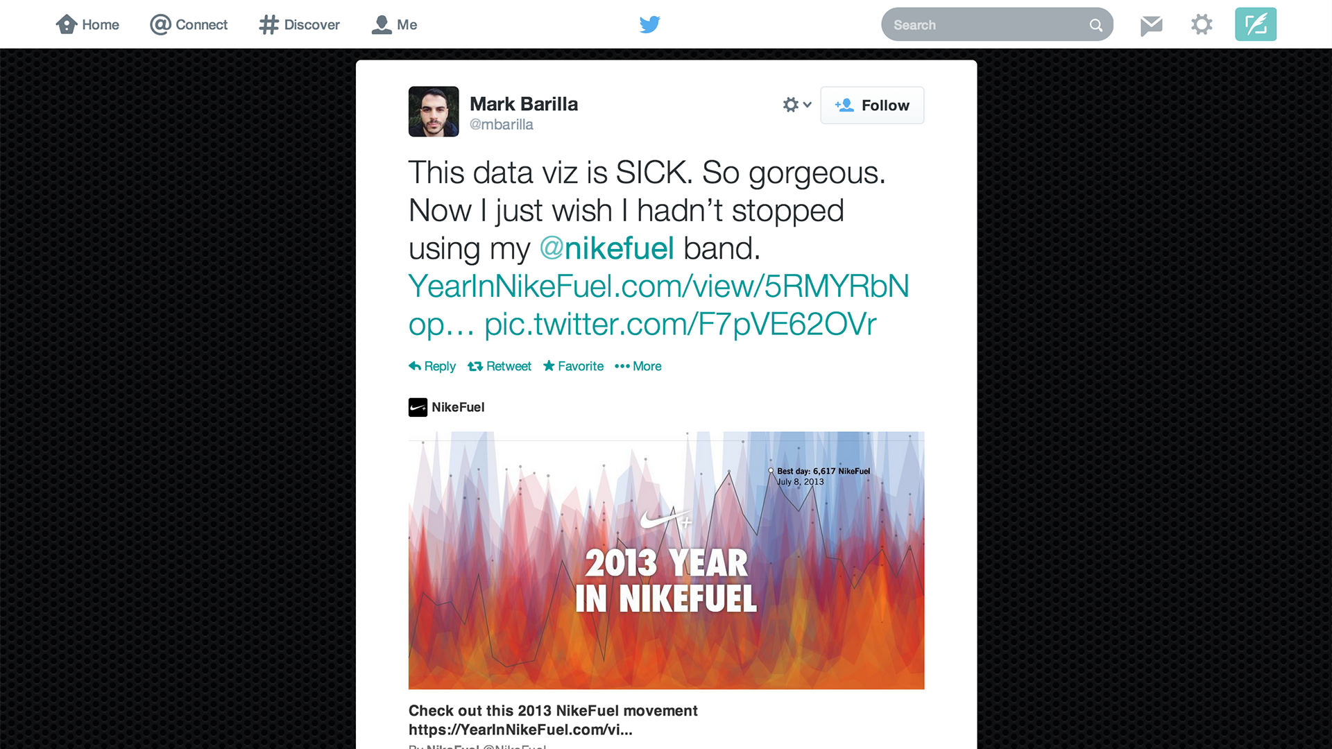
I created this visualization using Processing. I started playing about with different ways of representing this incredible amount of data from a full year worth of activity. The data story started to reveal itself when the "fingerprint" of how each person moves differently began to come into focus.
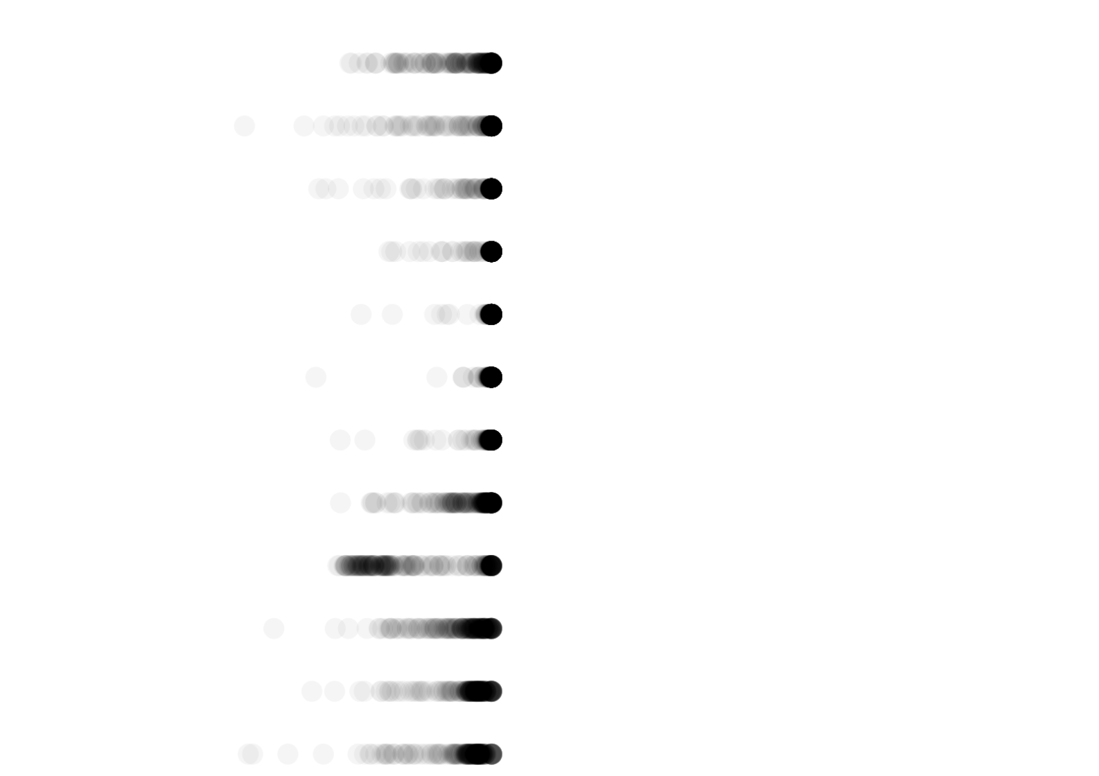
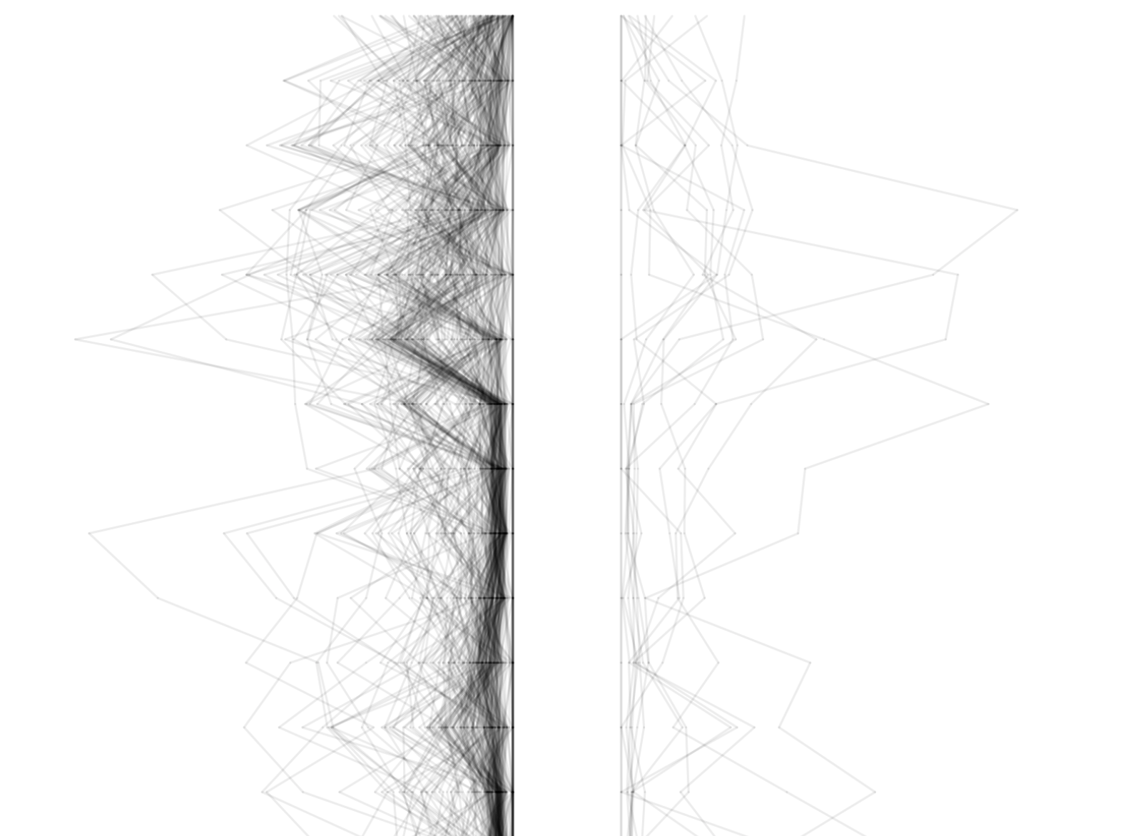
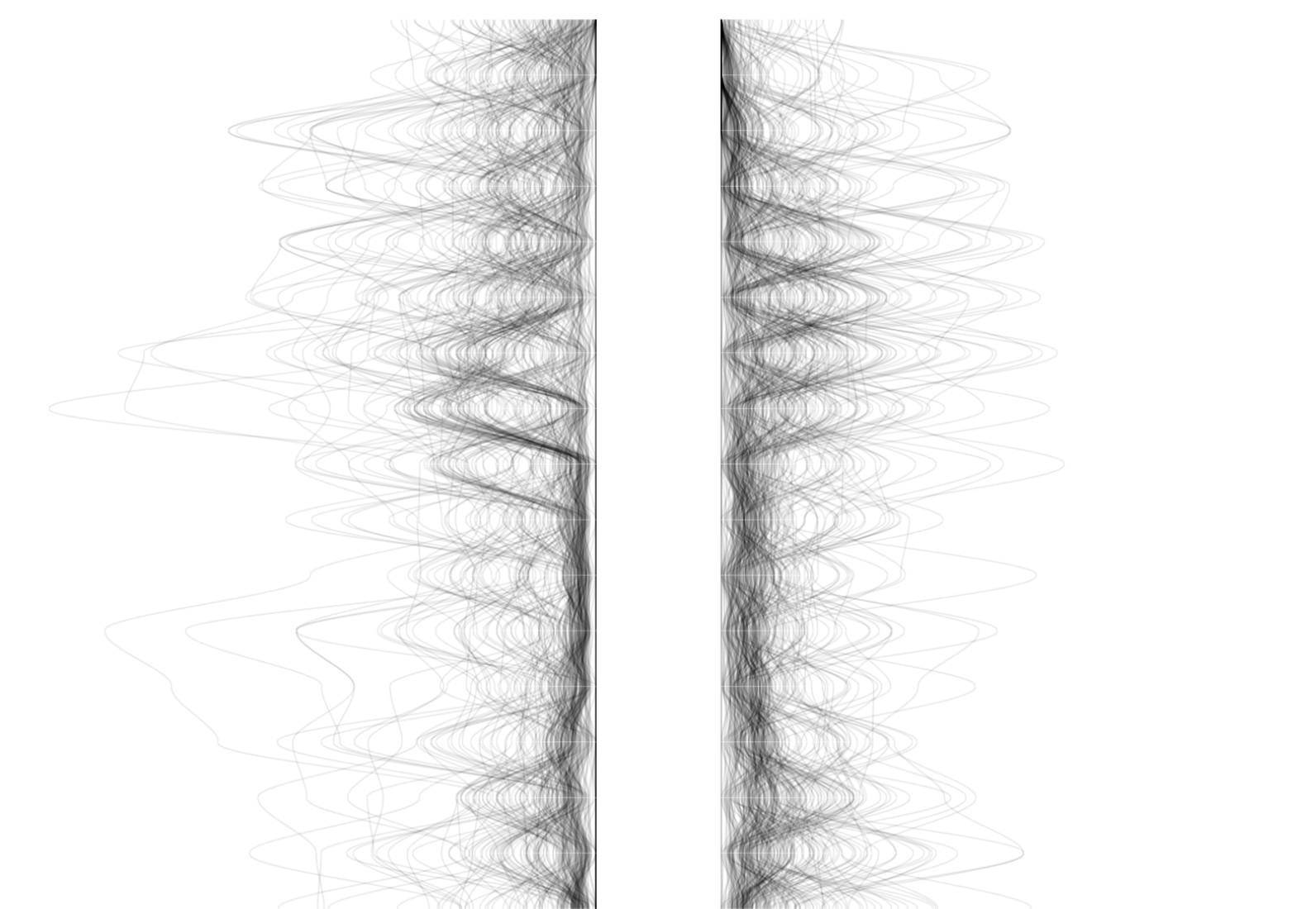
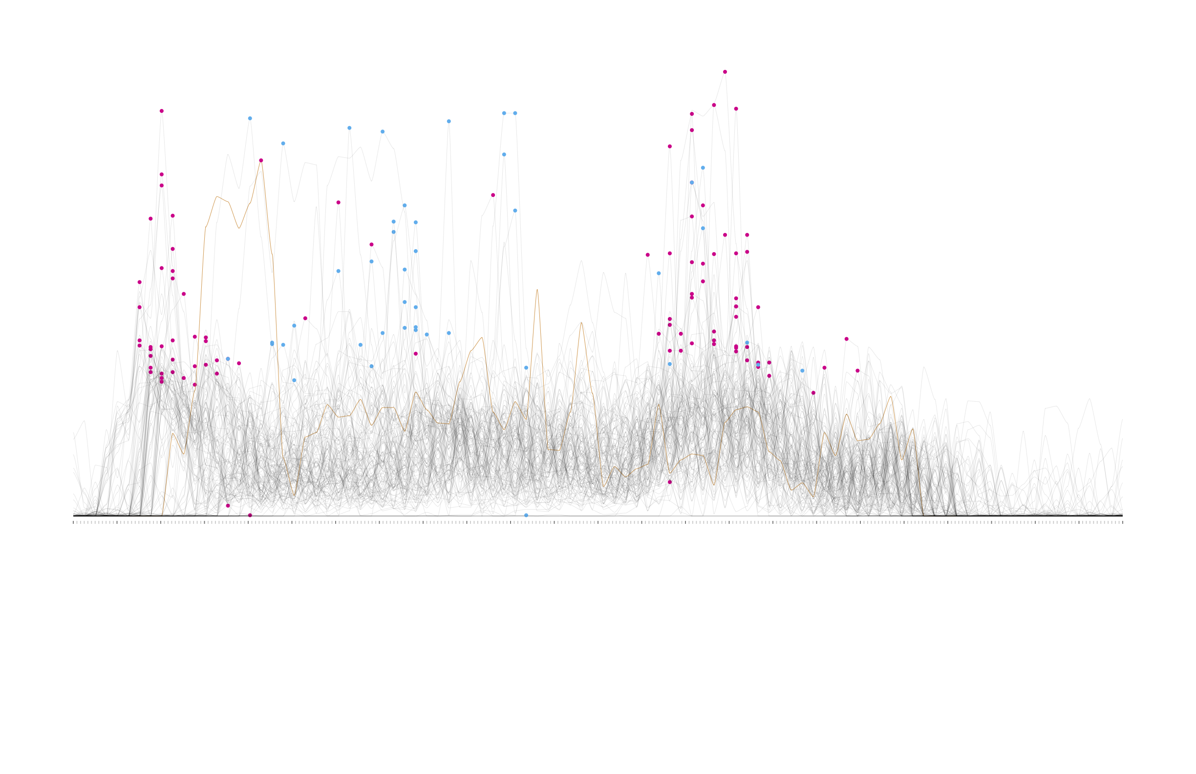
This image below represents each person on the Fathom team.
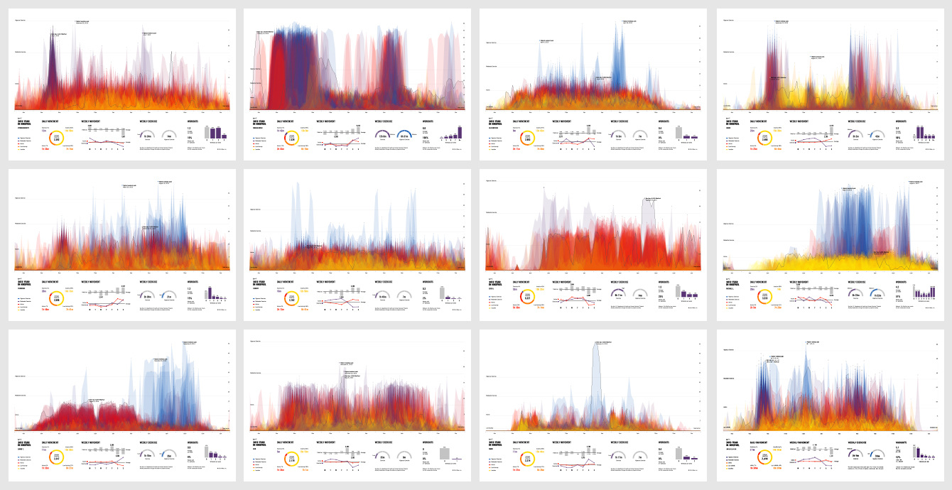
Deliverable
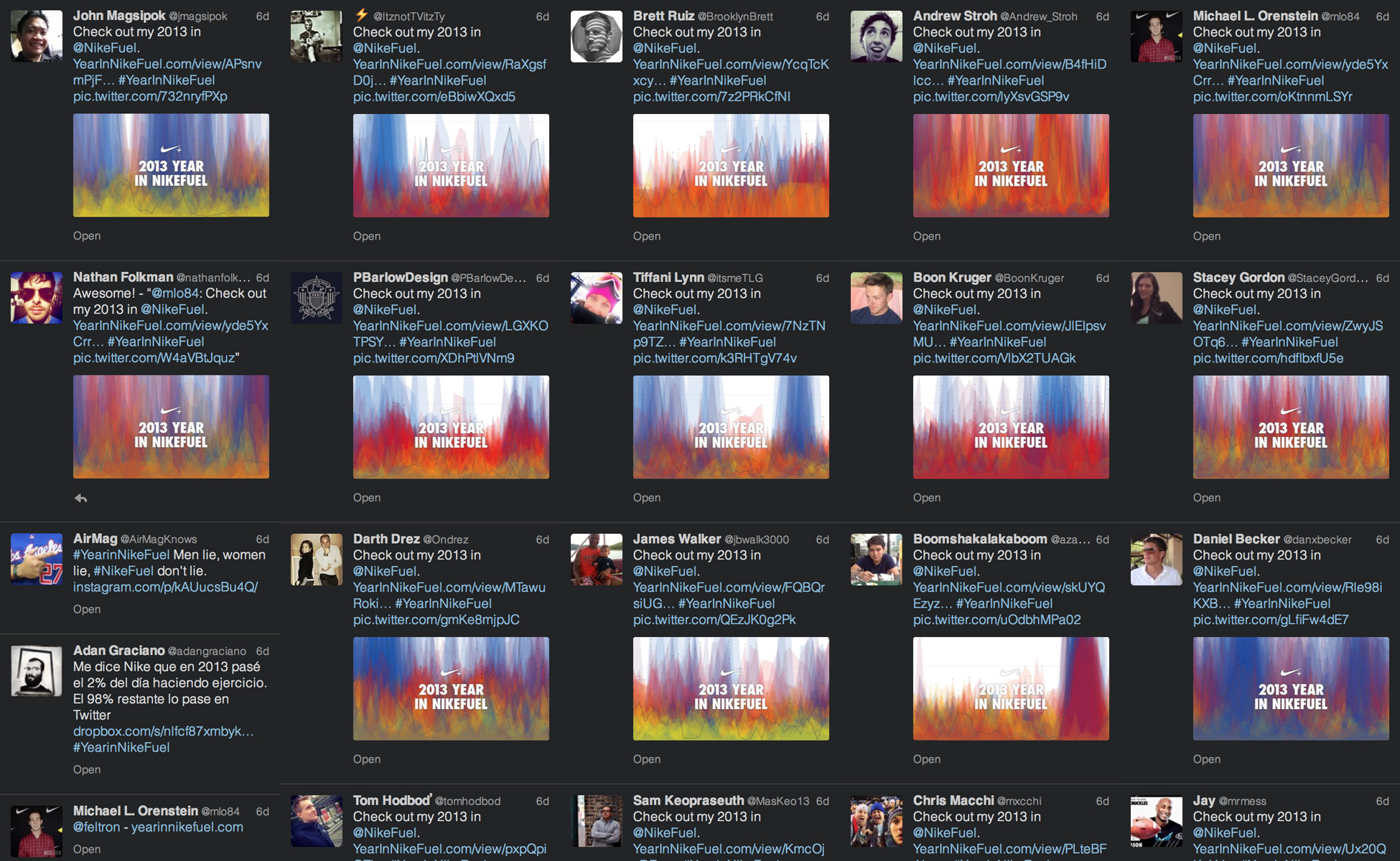
We built a microsite so that Nike could engage their users. FuelBand users could log in to see a year of their activity and share it with others in the community.
Selected Works
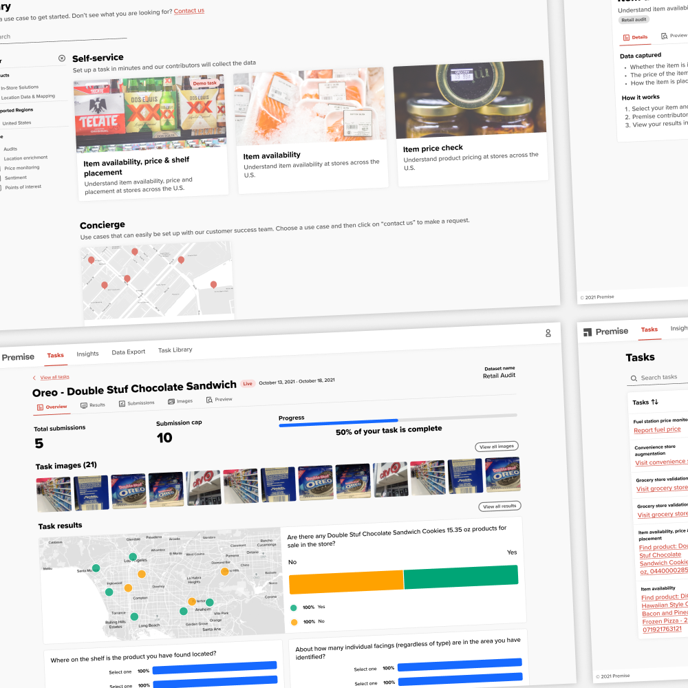
Premise's Customer ScaleupEnabled rapid customer growth with a self-service customer SaaS product
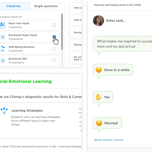
Student Check-insA new product for educators to easily check-in with their students to learn how they can better support them
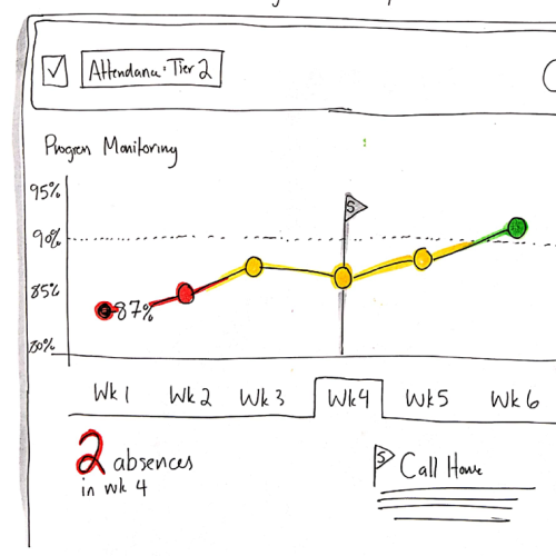
Student InterventionsA new product for educators to collaboratively support students through defining and running interventions
Survey Reporting RedesignAn IA and visualization redesign for Panorama's core product Survey Reports
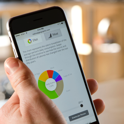
What the World EatsAn interactive data visualization for National Geographic
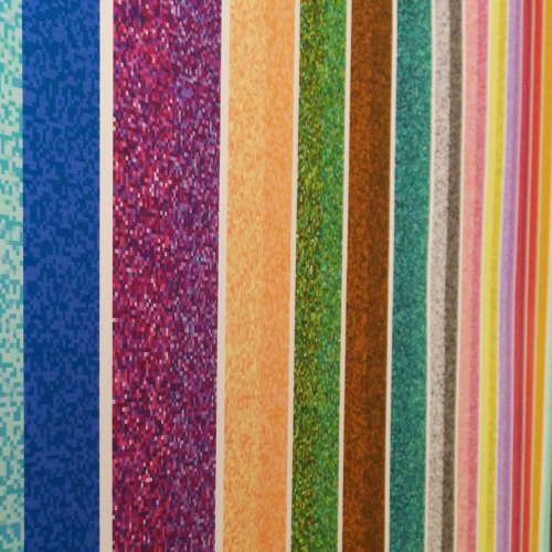
Colorful LanguageA personal project where I visualized how people around the world see color