What the World Eats
Summary
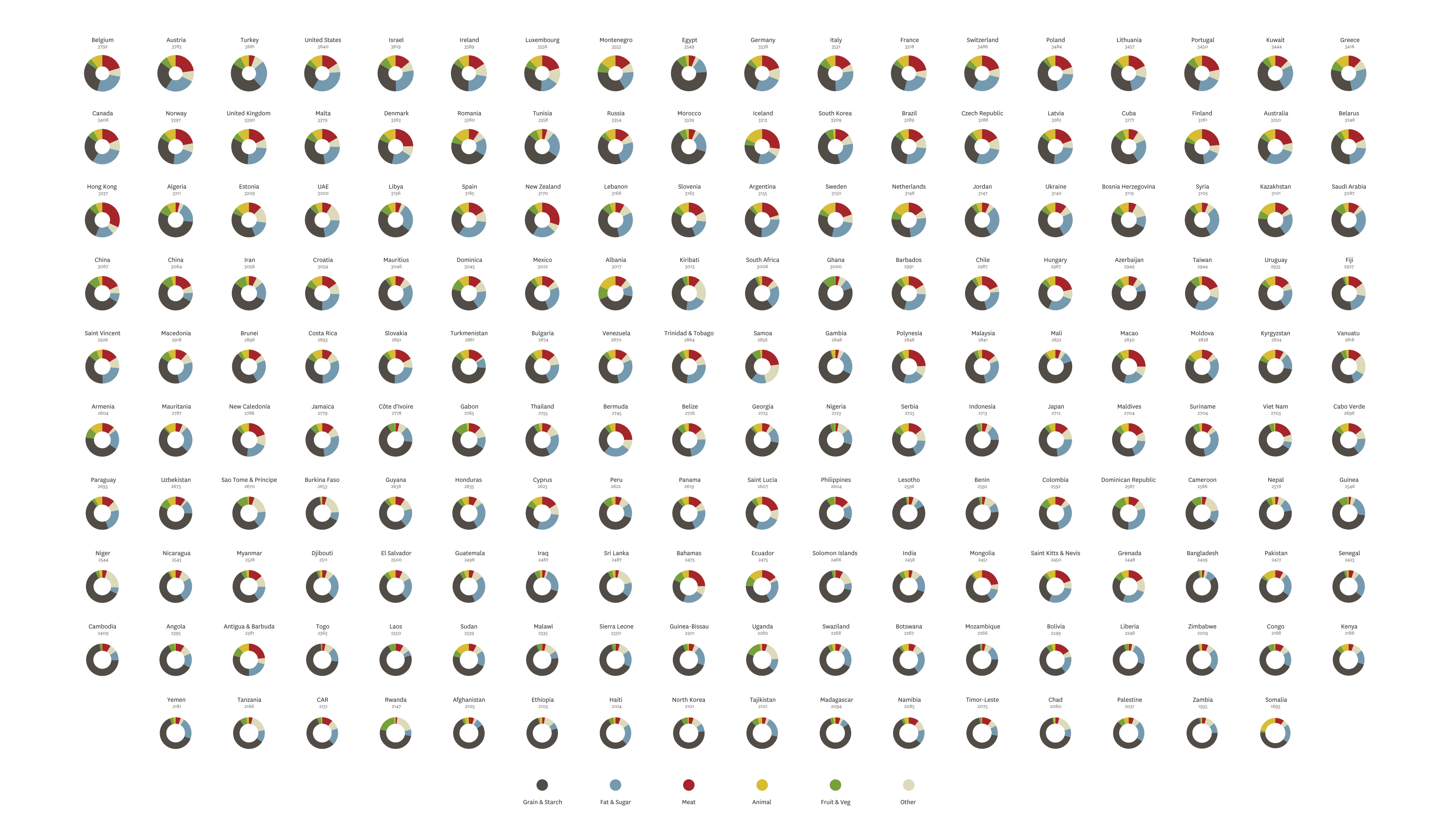
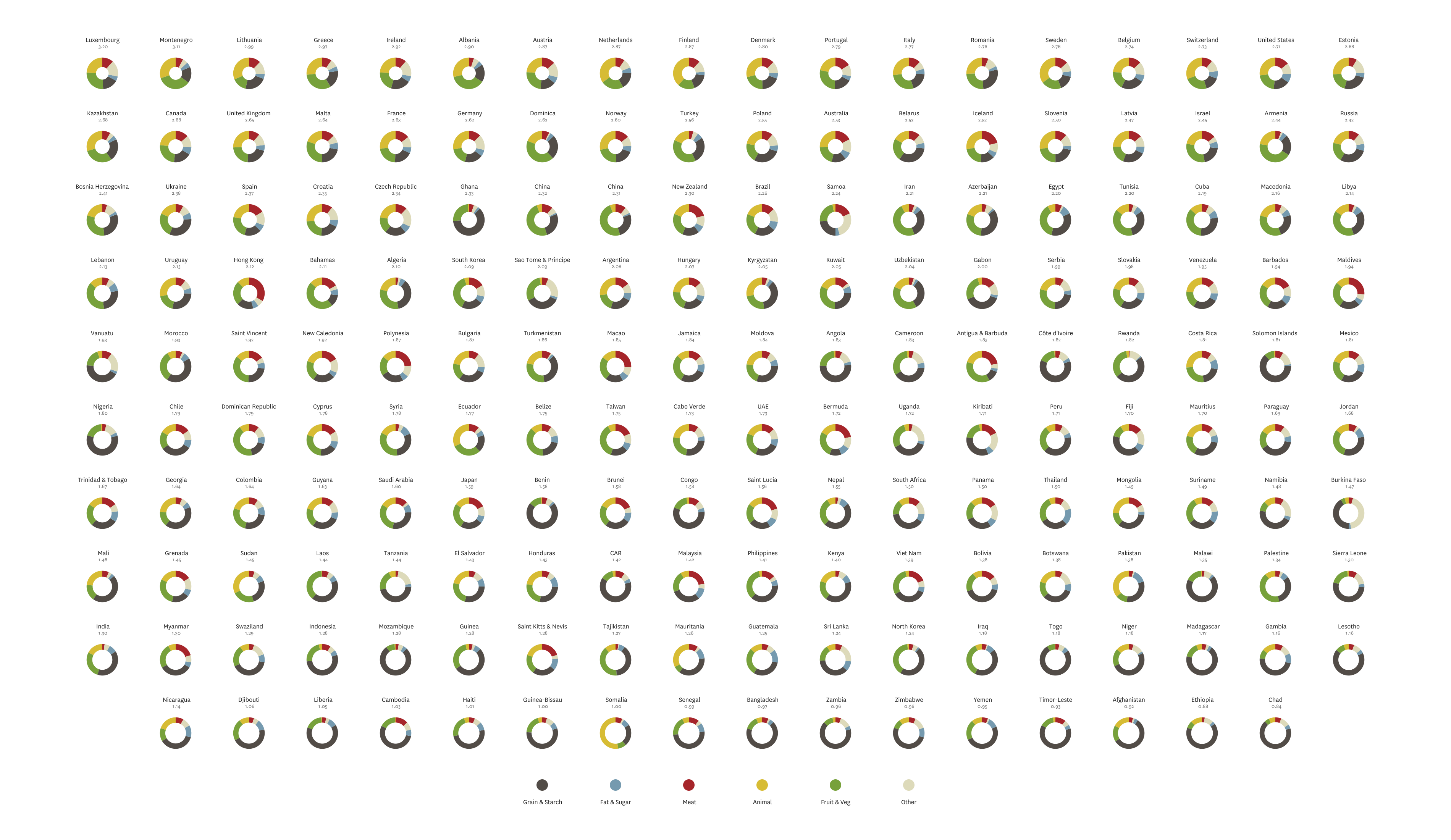
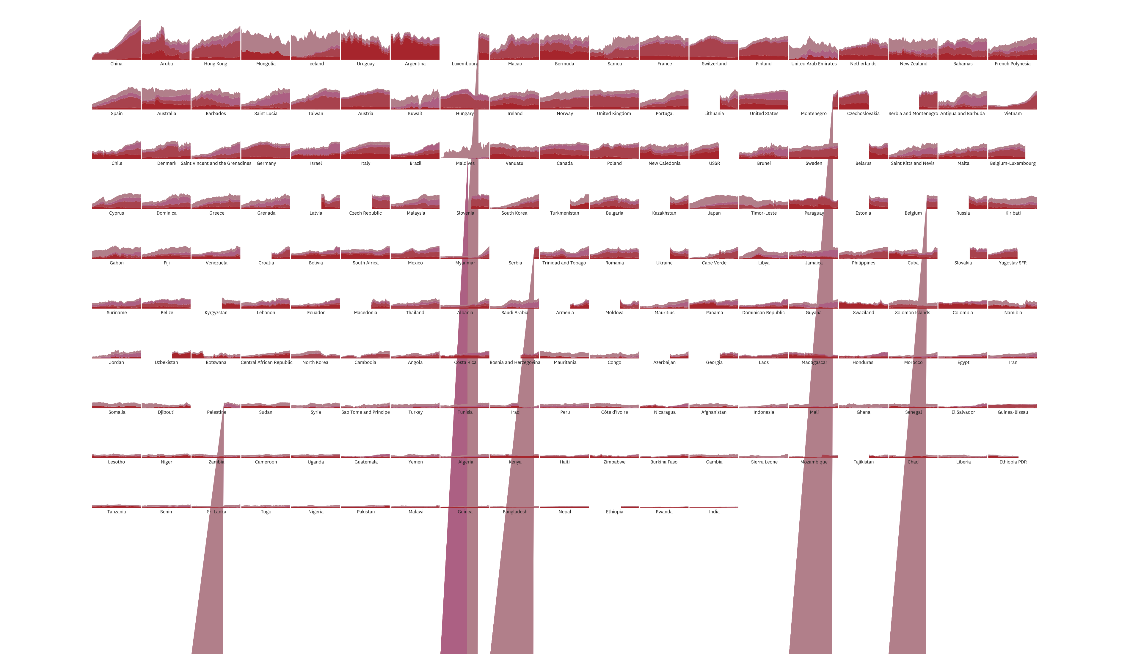
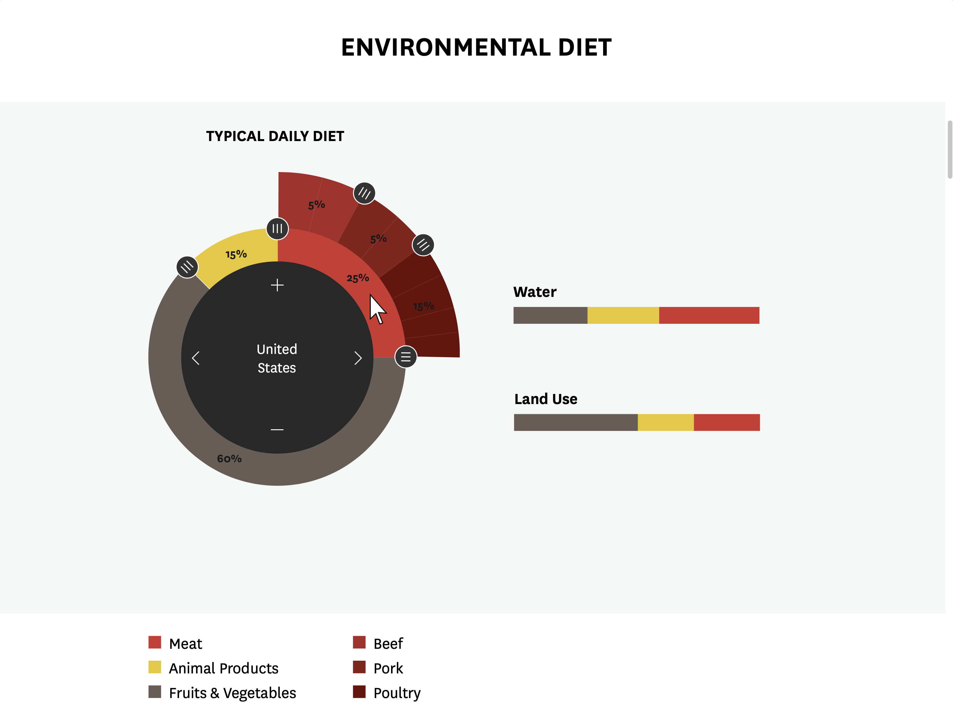
What the World Eats visualizes 50 years of food consumption patterns sourced from nations around the globe. This project was featured in National Geographic's Future of Food Series. The interactive visualization showcases the role of regional conflict, religion, and the health of the economy in thematically impacting consumption patterns.
Context
My role: Information Designer
The team: 1 Product Manager, 2 Engineers
Timeline: 6 weeks
Client: National Geographic
Deliverables: Data analysis, front-end coding, lo/hi-fidelity mockups.
Problem
National Geographic asked us to look at the challenges that food consumption poses to climate change. After doing research on the topic we set out to find a story that would illustrate this in a dataset from the Food & Agriculture Organization of the United Nations (FAOSTAT).
Design Process
I started by becoming familiar about some of the biggest trends that are stressing the planet. From there I parsed and began exploring the dataset through pivot tables.
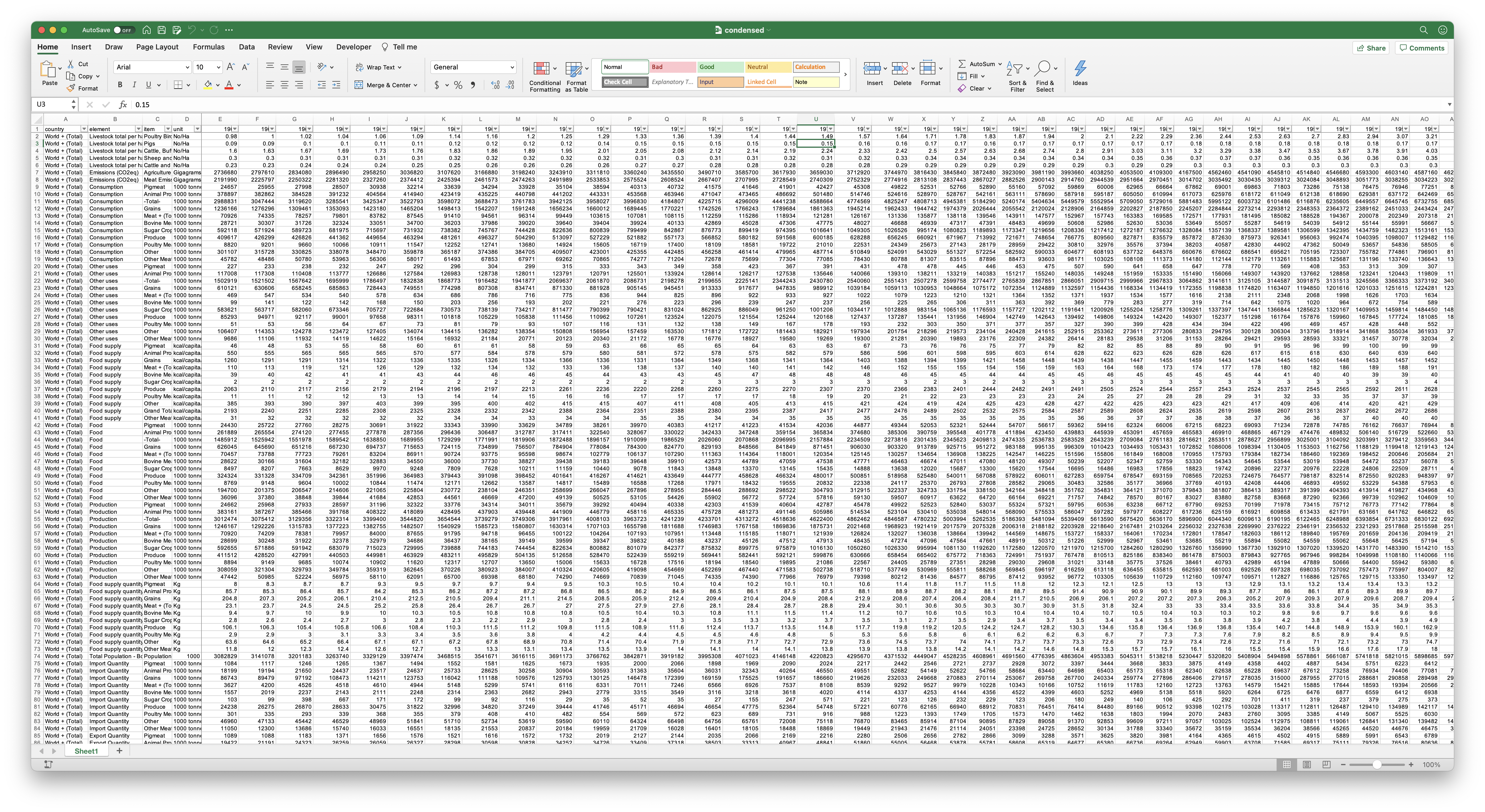
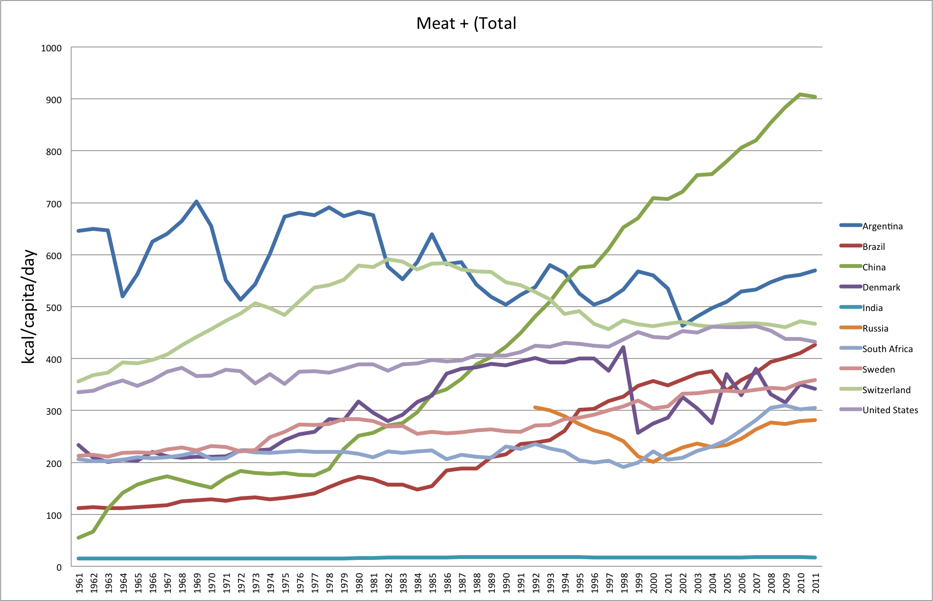
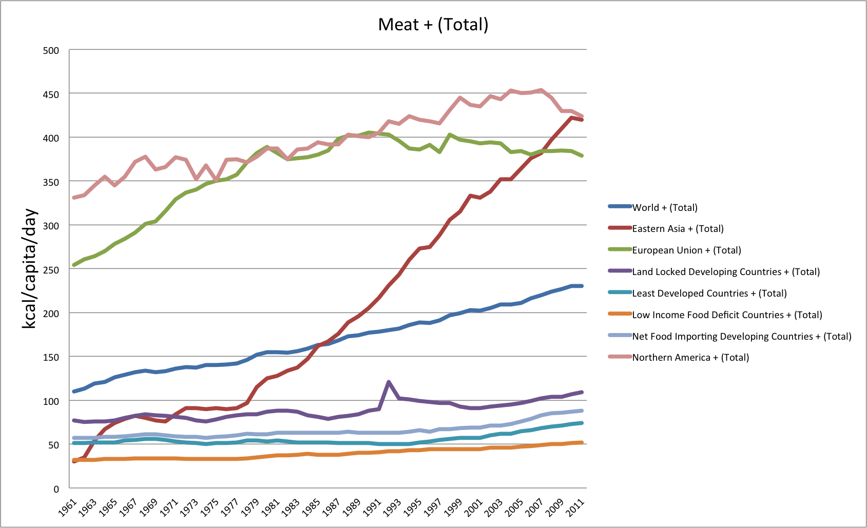
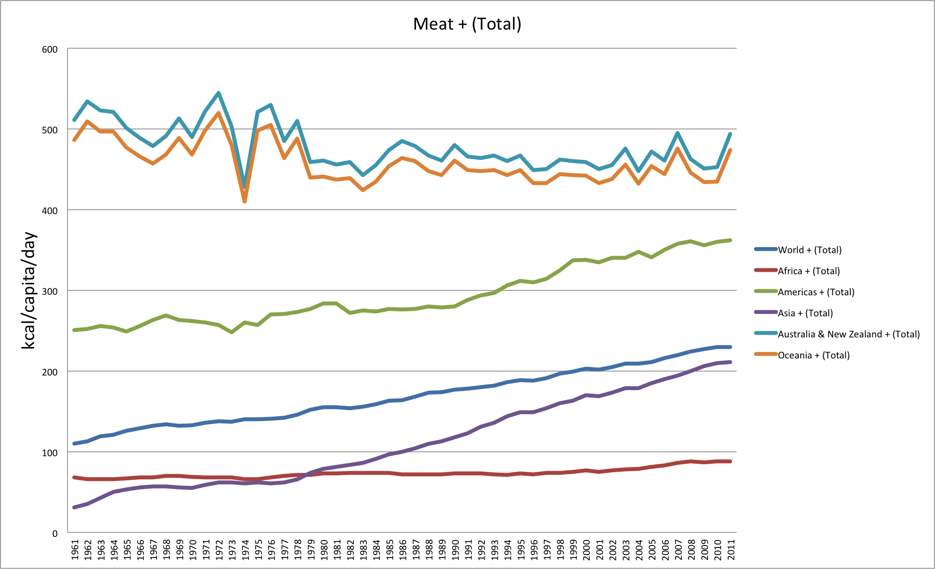
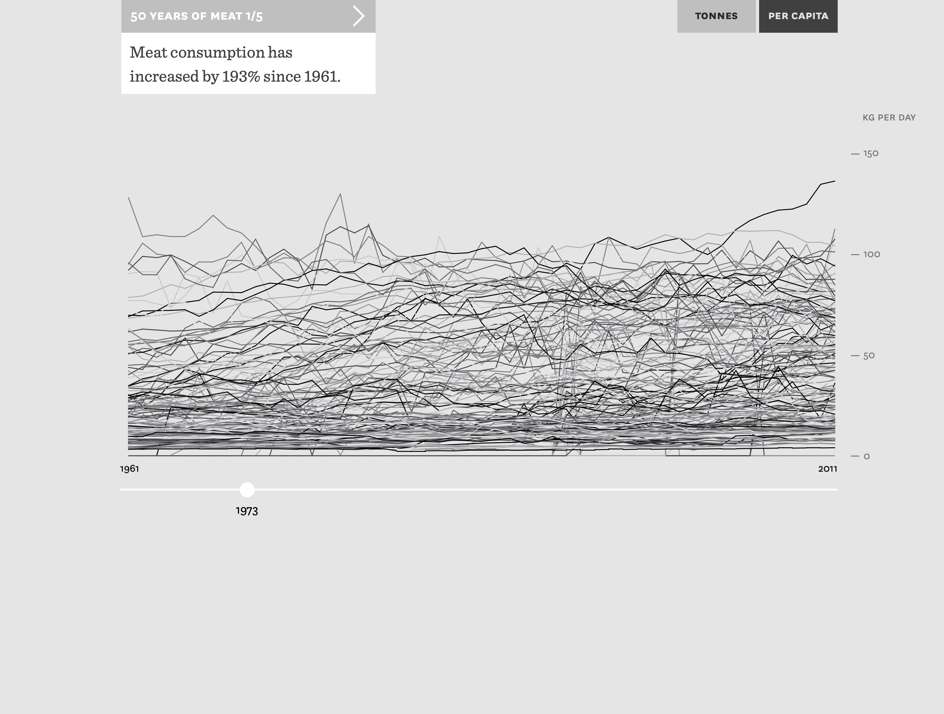
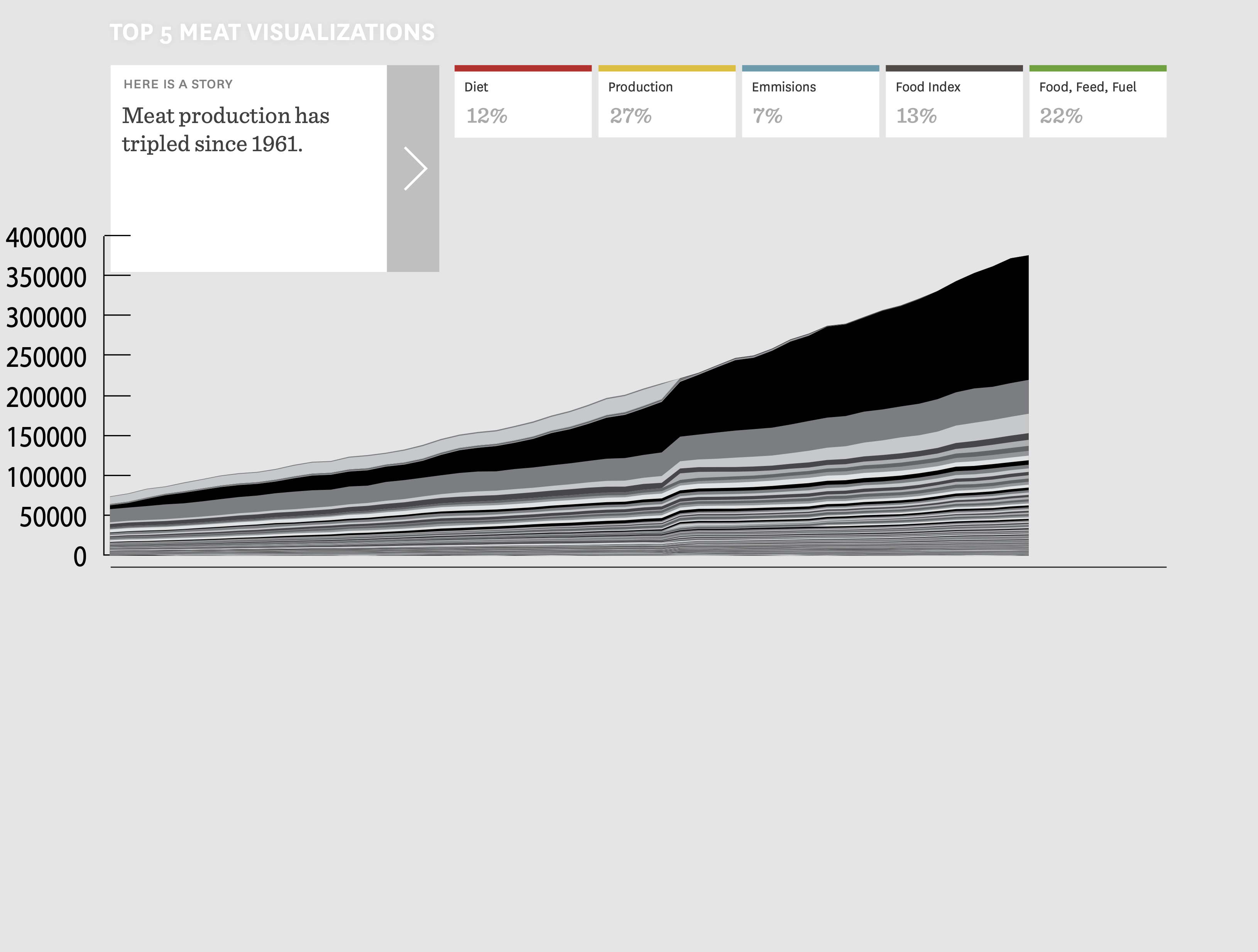
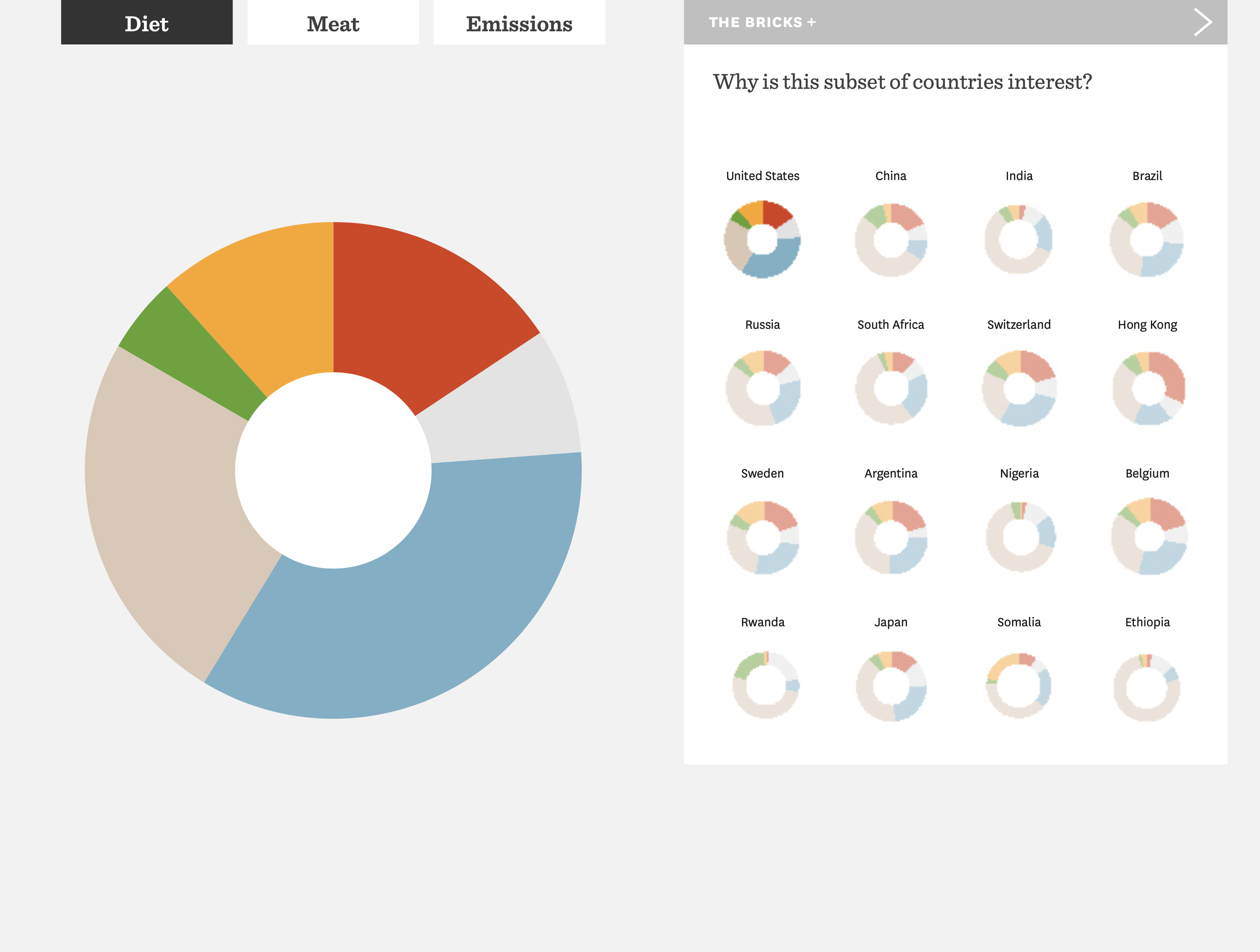
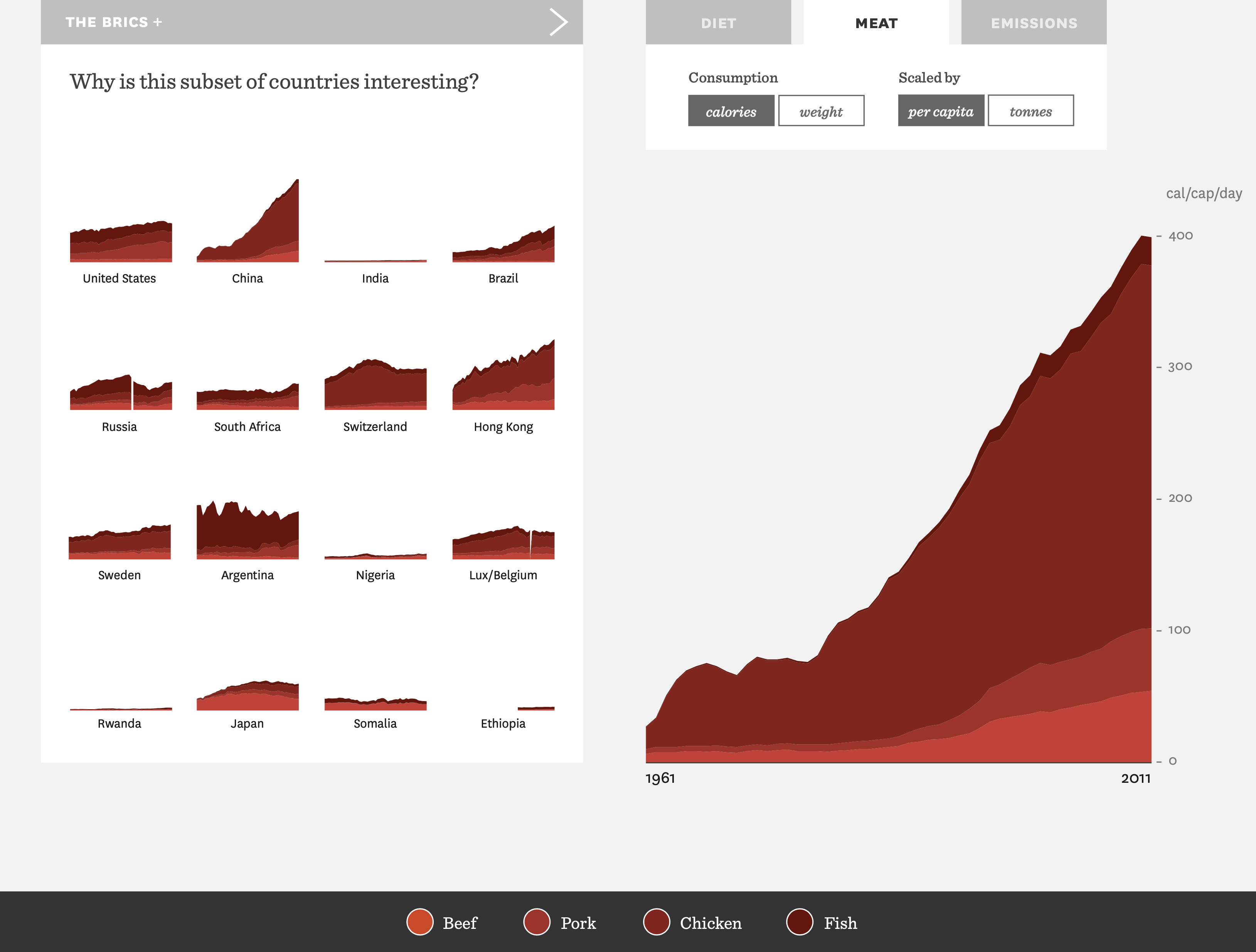
The story started to appear when we grouped food types into larger categories and plotted out caloric and weight consumption of food by country.
At this point I started working on the web page where we would display the interactive data visualization. The developer and I worked through many iterations of the interaction until it was fun to play with and the transitions were clear and crisp.
Outcome
Users spent an average of 8 minutes interacting with it which is well above the 1–2 minute benchmark. It also went viral on twitter and got picked up by some notable celebrities.
Press
What the World Eats .. http://t.co/FXBjuVOD8m #datascience
— MC HAMMER (@MCHammer) February 9, 2015
What the World Eats --extraordinary graphic from National Geographic http://t.co/bMO97JWy4G
— Michael Pollan (@michaelpollan) December 3, 2014
Selected Works
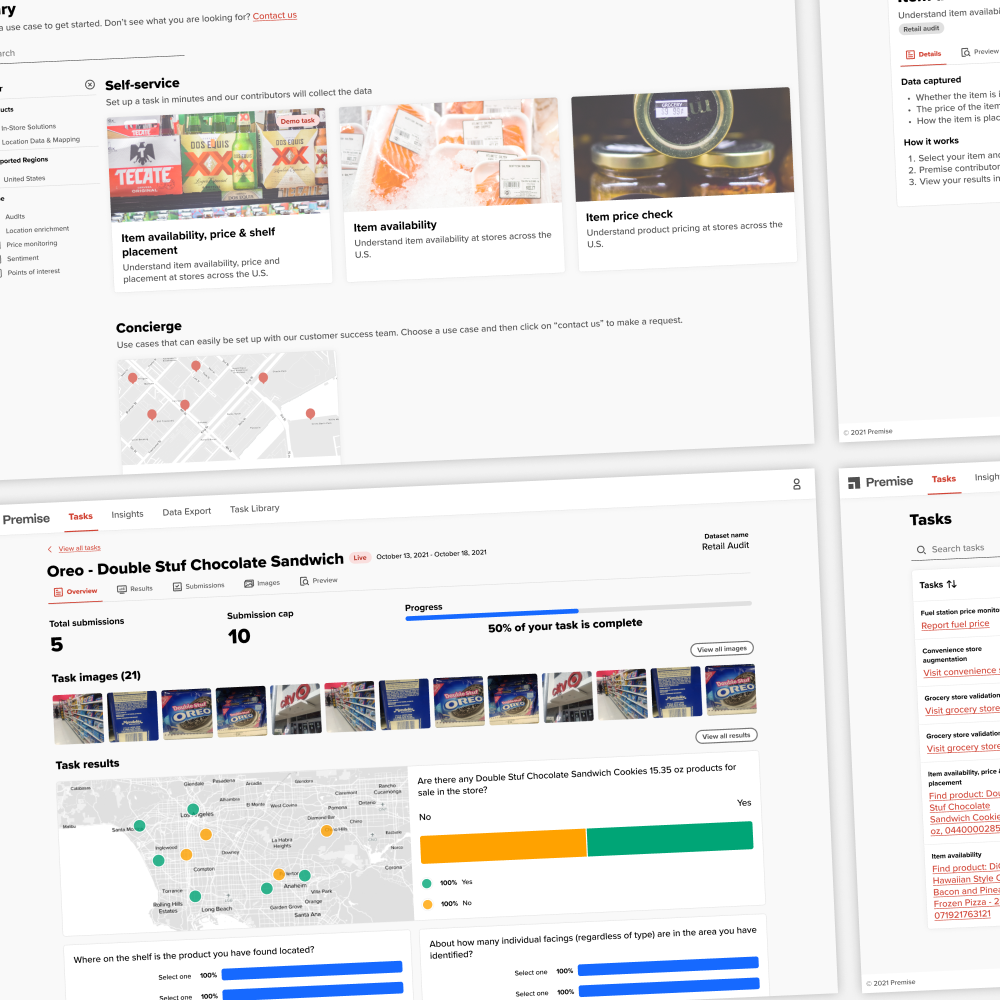
Premise's Customer ScaleupEnabled rapid customer growth with a self-service customer SaaS product
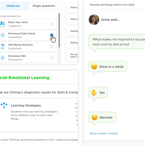
Student Check-insA new product for educators to easily check-in with their students to learn how they can better support them
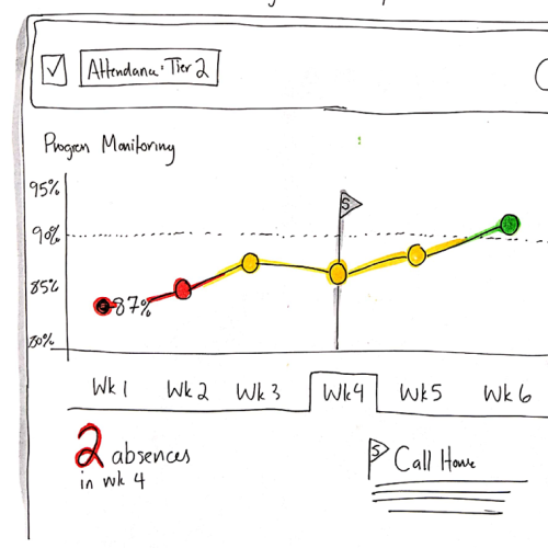
Student InterventionsA new product for educators to collaboratively support students through defining and running interventions
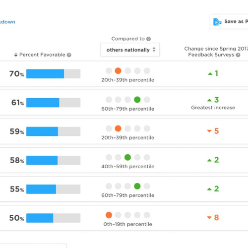
Survey Reporting RedesignAn IA and visualization redesign for Panorama's core product Survey Reports
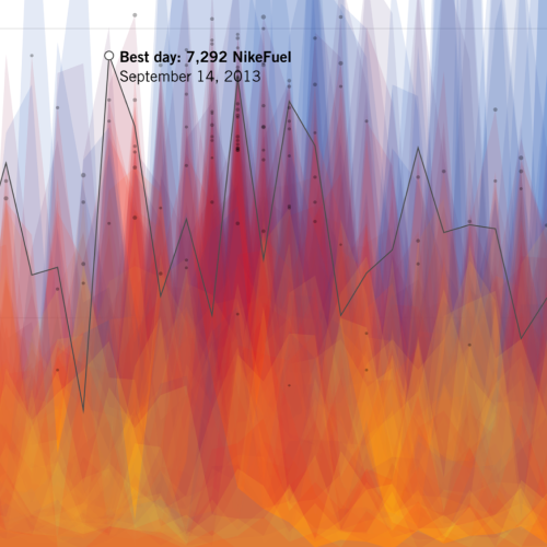
Year in NikefuelPersonalized visualizations showcasing how every person has a unique movement pattern for Nike
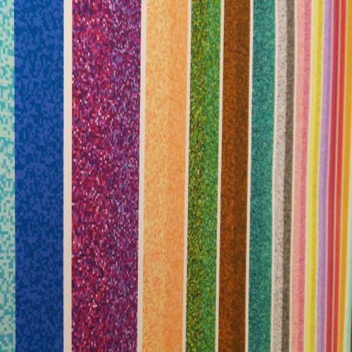
Colorful LanguageA personal project where I visualized how people around the world see color